


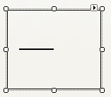
The dbicGauge control is designed to host a gauge image to allow the developer to specify the type of gauge being presented. When the control is first instantiated on a form the object is rendered as a rectangle with a needle representing the value of the control.
To customize the presentation select a custom image by clicking the elipse button in the BackImage property found in the Property Inspector in the IDE. NOTE: The control also has a BackgroundImage property. The image can be rendered in this property as well; however the control has no ability to mask colors in the image when placed here. NOTE: The custom image can be set at design time through the property inspector or at run time in code by specifying the path to the image in the BackImage property. The selected image is rendered in the control to create the gauge against which the needle (value of the control) is presented. NOTE: The image is not resized in any fashion. Consequently, the selected image size should match the size of the control.
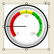
In the example above the gauge image background (white) is different to the color of the background of the form in which the object is instantiated. To adjust the appearance to match the background, set the MaskColor property to the color value in the gauge image to “mask” out. The control will present the mask color as the color behind the control; in essence making the image appear transparent where the mask color is found in the image. In the above example, setting the MaskColor to White masks out the white area around the black border of the gauge …
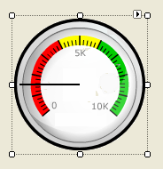
NOTE: The interior of the gauge image does not appear transparent as it is painted a slightly off-white color.