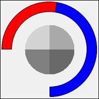
When the DisplayStyle property of the control is set to Circular, the display is divided into three sections ("Circle", "Path", "Center").
In the below explanations, the following settings have been used:
AngleStart = 0
AngleEnd = 270
Minimum = 0
Maximum = 270
CircleMeterWidth = 20
Height = 200
Width = 200
Path
The "Path" section is the portion of the display that spans from the AngleStart to AngleEnd of the circular dbicMeter. The path represents the entire available meter (from the Minimum to the Maximum). The properties associated with the display of this section are all prefixed with "Path".
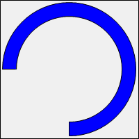
The above shows a dbicMeter with the following additional settings:
PathBackColor = Color.Blue
PathBorderColor = Color.Black
PathBorderWidth = 1
Center
The "Center" section is the interior section of the control, which spans from the very center of the meter to either the closest or furthest edge of the "Circle"/"Path" displays. The properties associated with this section are prefixed with "Center".
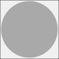
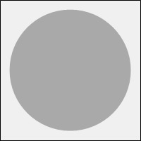
The above shows the same instance of the control, the left image shows the control with a CenterCircleSize of Outer and the right image shows the control set to Inner. The color of the center was set to Color.DarkGray using the CenterBackColor property.
The display of the "Center" section is always a full circle, regardless of the current settings of the AngleStart and AngleEnd properties.
Path and Center
Combining the display of the "Path" and "Center" from the above, results in the following display:
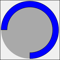
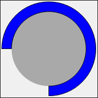
The above shows the same instance of the control, the left image shows the control with a CenterCircleSize of Outer and the right image shows the control set to Inner.
Circle
The "Circle" section is the portion of the display representing the current Value of the dbicMeter. The amount of this section displayed, is directly tied to the current setting of the Value property. The closer Value is to Maximum, the more of this section is seen (the opposite is true for the "Path" section).
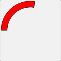
The above shows the instance of dbicMeter with a Value of 100 (as stated previously, the Minimum is 0, the Maximum is 270), which displays at almost half way between the start and end angles of the control (AngleStart = 0 and AngleEnd = 270).
Additionally, the following properties were set:
CircleBorderColor = Color.Black
CircleBorderWidth = 1
Path, Center and Circle
Combining the display of all three sections, results in the following:
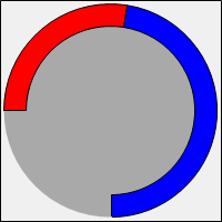
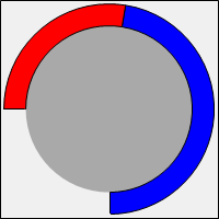
The above shows the same instance of the control, the left image shows the control with a CenterCircleSize of Outer and the right image shows the control set to Inner.
Using an Image
All three sections support the use of an image for their display. When assigned an image, their respective "BackColor" related properties are ignored and the image is used to fill their display. The image is drawn in memory, to the size of the control. Then only the portion of the image that lines up with the current dimensions of the section being drawn are kept, while the rest of the image is made transparent.
Background image:
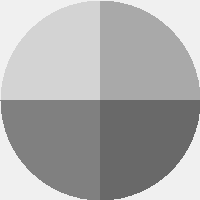
The above image is 200x200 (the same as the size of the control).
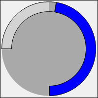
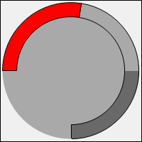
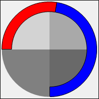
CircleBackImage PathBackImage CenterBackImage
If the same image is applied to all three sections at once:
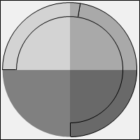
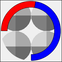
The image used should also be the same dimensions as the instance of the control. If the image supplied is smaller than the instance, the resulting display will use a tiled display of the image to cover all the available space.
This image is 100x100 (half the width and height of the control)

If applied to the CenterBackImage property of a control that is 200x200, the resulting display is:
Taking that smaller image, and increasing its size to 200x200:

Then applying it to the CenterBackImage property: