


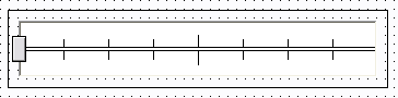
A default dbicSlide control instance appears as a horizontal rectangle with a default track image and thumb …
For more advanced implementations the control supports the use of custom images for the track and thumb portions of the control using the TrackImage, TrackImageAfter, TrackImageDisabled, ThumbImage, and ThumbImageDown properties of the control.
In the following example the TrackImage property is set to …

And the ThumbImage property is set to …

To create the following custom slider …

NOTE: The image used in the ThumbImage property has a white background which overrides the TrackImage behind the thumb. To make the ThumbImage appear transparent, set the MaskColor to white. Using Masking, the control replaces the mask color (in this case white) with the color behind the image (in this case the TrackImage).

TRACK IMAGES
Customized track images for values less than or greater than the thumb value allow the developer to change the track based on its value. In the example above the track color darkens to left of thumb as it moves to the right. The thumb can have two images applied to it, one for up (un-clicked), and the second for the clicked or down state. In the example to the left the arrows in the thumb turn read when it is in a clicked or down state.
 TrackImage
  TrackImageAfter
  Actual Control Display