|
|
|
|
|
ActiveX
Controls
for Enterprise
Application Design |
| |
|
|
|
|
|
|
|
|
|
|
|
  |
|
|
|
|
|
|
|
|
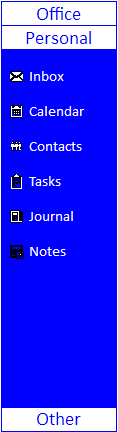
Add modern navigation features to new
and existing applications quickly and
economically. ctxListBar 32 is a
Unicode, multi-column navigation component
capable of displaying sets of sliding
lists; each list containing its own
group of items.
A List item may be represented by text
and/or an image (icons or bitmaps).
ctxListBar 32 offers traditional navigation
when clicking on a list bar button
sliding the selected list and its items
into view. When there are more list
items than can be displayed within the
viewable space, navigation buttons
automatically appear allowing the
end-user to scroll through the otherwise
hidden items. |
|
| |
|
|
| |
|
|
| |
 |
|
| |
|
|
| |
|
|
| |
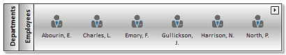
Multiple Columns :
Offer end-users direct navigation with
multiple columns. |
|
| |
|
|
| |
XML Support : All
data, including presentation detail and
style settings, consumed by ctxListBar
32
can be imported from or exported to an
XML file. XML Styles data is easily
consumed by other supported DBI
components offering developers an
economical method for maintaining
presentations. |
|
| |
|
|
| |
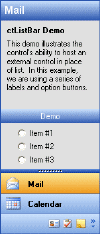
Host other Objects :
Enhance application functionality by
hosting other objects within the list
portion of ctxListBar 32. |
|
| |
|
|
| |
|
|
| |
 Control
Style Property : By changing
just one property, cascade those new
style settings throughout the control
for consistent presentations. Control
Style Property : By changing
just one property, cascade those new
style settings throughout the control
for consistent presentations.
Horizontal and Vertical Styles
: Unique, yet simple presentation
options with vertical or horizontal
orientation.
Images for List Bars :
Assign picture clips to the list bars.
Image Backgrounds :
Create your own diverse backgrounds with
user defined images.
Current Themes and Styles
: Enhance presentations with current
themes and styles for the background of
the list, list bars, and navigation
buttons. Stock styles include patters
for horizontal, vertical, diagonal,
horizontal bump, vertical bump, pyramid,
diamond, circular and elliptical
gradient fills.
ListBar Mouse Over Color
: As the mouse moves over certain areas
of the control, the developer can change
the appearance of that area. For list
items the control provides Over Back
Color, Over Font, Over Style, and Over
Text Color properties for customizing
presentations. For list bars the control
provides a Bar Fore Color Over property. |
|
| |
|
|
| |
|
|
| |
ListBar Mouse Over Color
: As the mouse moves over certain areas
of the control, the developer can change
the appearance of that area. For list
items the control provides Over Back
Color, Over Font, Over Style, and Over
Text Color properties for customizing
presentations. For list bars the control
provides a Bar Fore Color Over property. |
|
| |
|
|
| |
Drag and Drop : Drag
into and out of the ListBar component.
Settings also allow the control to
automatically open a closed group as an
item is dragged over the appropriate
group button. |
|
| |
|
|
| |
 Image
Backgrounds : Create your own
diverse backgrounds with user defined
images. Image
Backgrounds : Create your own
diverse backgrounds with user defined
images.
Text Options : The control
provides embedded support for assigning
and customizing the text strings used
for List Bars and List Items. Set one
or any combination of 15 properties to
create a perfect presentation.
Masked Bitmaps : ctxListBar 32
provides support for masked
bitmaps. Masked bitmaps appear to have
transparent backgrounds.
Transparent areas in a bitmap will be
determined by the MaskColor property of
the control. |
|
| |
|
|
| |
|
|
| |
Text Options : The
control provides embedded support for
assigning and customizing the text
strings used for List Bars and List
Items. Set one or any combination of 15
properties to create a perfect
presentation. |
|
| |
|
|
| |
Masked Bitmaps : The
control provides support for masking
bitmaps. Masked bitmaps appear to have
transparent backgrounds.
Transparent areas in a bitmap will be
determined by the MaskColor property of
the control. |
|
| |
|
|
| |
Tool Tips : Support for
tool tips for list items. |
|
| |
|
|
| |
Word Wrap : Text in a
list item can be wrapped. |
|
| |
|
|
| |
Image List : Store up
to 100 images in the internal image
list. |
|
| |
|
|
| |
Mouse Over and Select Status
: Diverse images, fonts, and colors for
each item when the mouse moves over an
item, or when an item is selected. |
|
| |
|
|
| |
Selected
Items : Support for the ability
to mark a selected Item.
Text Alignment : Text
alignment within the list bars and list
items.
Navigation Buttons :
Navigation buttons may be placed in the
list and on either side of the list or,
on the list bars or on either side of
the list.
Border Styles : Support
for regular, thin and flat styles. |
|
| |
|
|
| |
|
|
|
|
| |
|
|
|
|
| |
|
|
|
|
| |
 |
|
| |
|
|
|
|
| |
 |
|
 |
|
| |
|
|
|
|